
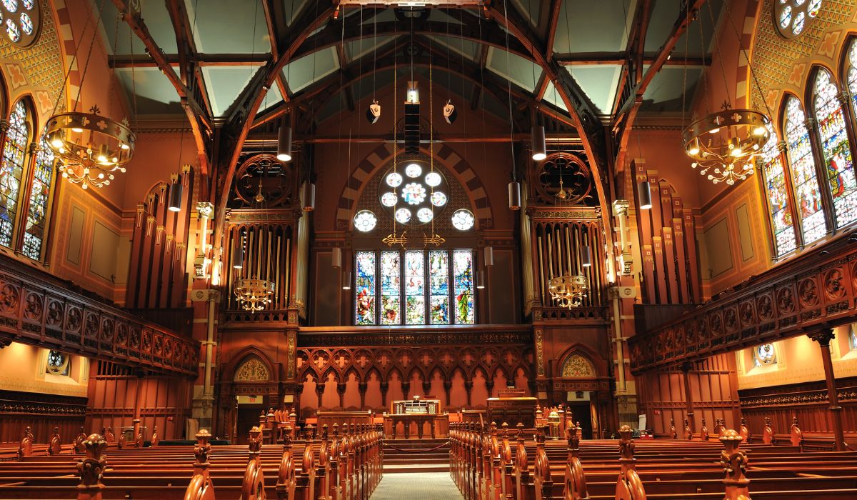
What’s In This Guide
- Why Do Paint Colors Matter So Much in Historic Boston Sanctuaries?
- What Architectural Features Should Guide Sanctuary Color Choices?
- How Do Lighting Conditions Change the Way Paint Colors Appear?
- How Do Denominational Traditions and Congregation Expectations Shape Color Decisions?
- How Should Boston Churches Test Paint Colors Before Committing?
- Which Color Directions Work Well in Historic Sanctuaries?
- What Preservation and Approval Considerations Apply in Boston?
- When Should a Boston Church Bring in Professional Painting and Color Help?
- Frequently Asked Questions
- Ready to Plan Church Interior Painting for Your Boston Sanctuary?
Choosing interior paint colors for a historic Boston sanctuary involves more than picking a shade the committee likes. The right palette should respect the building’s architecture, work with stained glass and woodwork, hold up under changing light, and account for the expectations of both longtime members and newer attendees. In a historic sanctuary, color selection should be treated as both a preservation and design decision.
For congregations planning church interior painting Boston, several factors can help committees choose historic church colors with confidence and avoid costly repaints. Consulting with experienced church renovation companies can help committees balance these complex factors effectively.
Quick Facts
- Architecture should guide the palette: Boston’s Gothic Revival, Romanesque, and Colonial-era sanctuaries often reflect distinct historic color traditions that new paint should consider.
- Light changes everything: North-facing sanctuaries, stained glass, and warm artificial lighting can shift how the same paint color reads from morning services to evening events.
- Testing prevents regret: Large painted samples observed across several days and lighting conditions reveal problems that small paint chips hide.
- Approvals may apply: Some designated Boston Landmarks include protected interiors, so committees should confirm review requirements before finalizing colors.
- Paint history matters: Historic sanctuaries may retain earlier decorative schemes beneath modern layers, and paint investigation can help guide a historically informed restoration palette.
Why Do Paint Colors Matter So Much in Historic Boston Sanctuaries?
Paint color shapes how a sanctuary feels, how its architecture reads, and how the congregation experiences worship. In historic Boston churches, color also carries preservation weight because earlier decorative schemes are part of the building’s record.
Boston’s worship spaces span centuries of design, from simple Colonial meetinghouses to richly detailed Gothic Revival and Romanesque sanctuaries. Each style came with its own approach to color. Meetinghouses often favored restrained, light palettes. Victorian-era sanctuaries frequently used layered, saturated schemes with stenciling and gilded accents.
The National Park Service notes that researching a building’s interior paint history is the key to a successful preservation or restoration project, because historic paint colors can reflect the time, taste, values, and character of different periods in a building’s history. A sanctuary repainted in colors that ignore that history can feel unmoored from its own architecture, even if the shade looks appealing on a sample card.
What Architectural Features Should Guide Sanctuary Color Choices?
Original Woodwork and Trim
Dark oak, walnut, and mahogany woodwork anchor many historic Boston sanctuaries. Wall colors need enough contrast to let trim, wainscoting, and pew ends stand out. Warm neutrals such as cream, parchment, and soft beige typically flatter dark wood, while stark bright whites can make aged finishes look dull or yellowed by comparison.
Stained Glass Windows
Stained glass projects colored light across walls throughout the day. Committees should evaluate paint samples while that colored light is active, not just under neutral conditions. Muted wall tones usually let window imagery remain the visual focus. Highly saturated wall colors can compete with the glass or create clashing color casts.
Plaster Walls, Ceilings, and Decorative Details
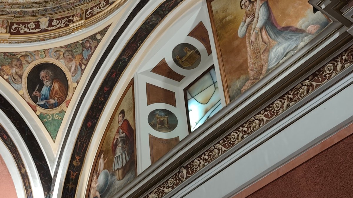
Cornices, medallions, arches, and decorative ceiling panels often benefit from subtle color shifts that define each element without fragmenting the space. Many historic schemes used two or three closely related tones to give ornamental plaster depth. Cracked or loose plaster should be repaired before repainting, while the cause of any staining should be identified and addressed before new paint is applied.
Flooring, Pews, and Furnishings
Carpet runners, tile, pew upholstery, and altar furnishings all contribute fixed color to the room. A wall color chosen in isolation can clash with a carpet that is staying in place for another decade. Committees should list every element that is not changing and confirm the proposed palette works with all of them.
How Do Lighting Conditions Change the Way Paint Colors Appear?
Natural Light and Window Orientation
Boston’s seasonal daylight and variable weather can cause sanctuary colors to appear different throughout the day and year. North-facing spaces often receive cooler, indirect light, which can make warm colors appear more subdued and cool colors more pronounced. East-facing windows receive stronger morning light that changes as the day progresses. Colors should be reviewed in morning, midday, and late-day conditions before approval.
Artificial and Layered Lighting
Chandeliers, pendants, and accent fixtures can affect how paint colors appear depending on the light source and color temperature. Warm lighting around 2700K can make warm hues appear richer, while cooler lighting can shift their appearance and reduce perceived warmth. If a lighting upgrade is part of the renovation plan, paint and lighting selections should be coordinated so the final conditions are evaluated together.
How Do Denominational Traditions and Congregation Expectations Shape Color Decisions?
Color carries symbolic meaning in many traditions, and congregations often hold strong emotional attachments to how their sanctuary has always looked. Both realities deserve a seat at the table.
Some liturgical traditions associate specific colors with seasons, saints, or theological themes, which can inform accent choices around the altar or chancel. Congregational and other Protestant meetinghouse traditions often favor simpler, lighter palettes. The palette should reflect the denomination, building history, and congregation that uses the space.
Committees can reduce friction by:
- Sharing two or three vetted palette options rather than an open-ended color vote
- Explaining the architectural reasoning behind each option
- Displaying large samples in the sanctuary where members can see them in context
- Documenting the decision process for future reference
A transparent process can help build congregational support and reduce the risk of a repainting project stalling during the approval stage.
How Should Boston Churches Test Paint Colors Before Committing?
Step 1: Document the Existing Conditions
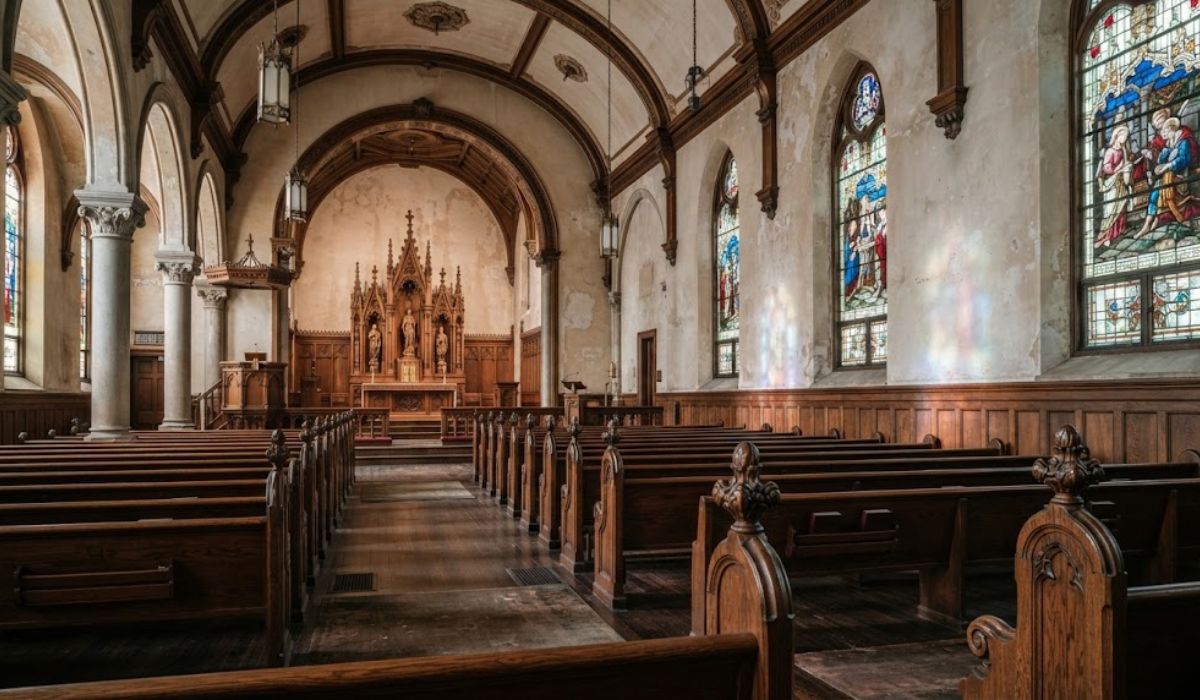
Photograph the sanctuary at different times of day and note the fixed elements: woodwork, glass, flooring, and furnishings. These photos become the reference set for every color discussion.
Step 2: Investigate the Paint History
In older sanctuaries, earlier decorative schemes may survive beneath modern layers. A professional paint investigation may help identify earlier colors, stenciling, and other decorative treatments, which can guide a historically informed restoration palette or help shape a compatible new one.
Step 3: Narrow to a Short List
Select two to four candidate colors per surface based on the architecture, light conditions, and congregation input. Avoid presenting a full fan deck to a committee; broad choice tends to stall decisions.
Step 4: Apply Large Test Areas
Use large sample boards or apply test patches directly to inconspicuous wall areas. Small paint chips provide limited context for judging how a color will appear across a large sanctuary surface.
Step 5: Observe Across Days and Lighting Conditions
Review the samples in morning light, afternoon light, evening artificial light, and under the color casts created by stained glass. Include overcast conditions as well, because they can noticeably change how colors appear in the space.
Step 6: Confirm Sheen and Surface Preparation
Flat and matte finishes tend to minimize the appearance of plaster imperfections, while higher-sheen finishes can make them more noticeable. Confirm that walls and ceilings are sound, repaired, and properly primed so the chosen color performs as expected.
READ MORE: Which Color Is Best for a Church Interior During Historical Restoration?
Which Color Directions Work Well in Historic Sanctuaries?
Historic sanctuary palettes often draw from a few common color directions. The table below summarizes several options and the settings where each may work well.
|
Color Direction |
Typical Use |
Best Fit |
|---|---|---|
|
Warm neutrals, such as cream, parchment, and soft beige |
Main walls |
Sanctuaries with dark woodwork and stained glass |
|
Soft historic whites |
Ceilings, trim |
Colonial meetinghouses and light-filled spaces |
|
Muted blues and grays |
Walls, ceiling panels |
Cooler palettes seeking calm and depth |
|
Deep symbolic accents (violet, red, green) |
Chancel, altar area, trim details |
Liturgical traditions and Victorian-era schemes |
|
Gilded or metallic details |
Moldings, medallions |
Ornamental plaster restoration |
Two cautions apply. Very dark walls can make a sanctuary with limited daylight feel heavier, especially in winter. Modern grays and stark whites may appear cold or visually disconnected from some nineteenth-century interiors. In many historic sanctuaries, warmer, softer colors may integrate more naturally with existing woodwork, plaster, stained glass, and decorative details.
What Preservation and Approval Considerations Apply in Boston?
Some Boston churches may require formal review before certain work can proceed. The Boston Landmarks Commission reviews exterior changes and, in some cases, interior changes to designated Individual Landmarks and properties within local historic districts through its design review process.
Interior review requirements depend on the property’s local designation and applicable study report or design guidelines, so committees should confirm the building’s status before finalizing plans. Listing in the National Register of Historic Places alone does not restrict what a non-federal owner may do, although federal funding, licensing, or permitting can trigger additional review, and preservation grants may carry program-specific conditions.
Practical steps for building committees:
- Check the building’s designation status through the city’s landmark records
- Review any study report or design guidelines tied to the property
- Keep documentation of existing decorative finishes before covering them
- Choose reversible, compatible treatments where historic decorative painting survives
Addressing these questions early can reduce the risk of mid-project delays and help the church remain aligned with applicable preservation requirements and funding conditions.
When Should a Boston Church Bring in Professional Painting and Color Help?
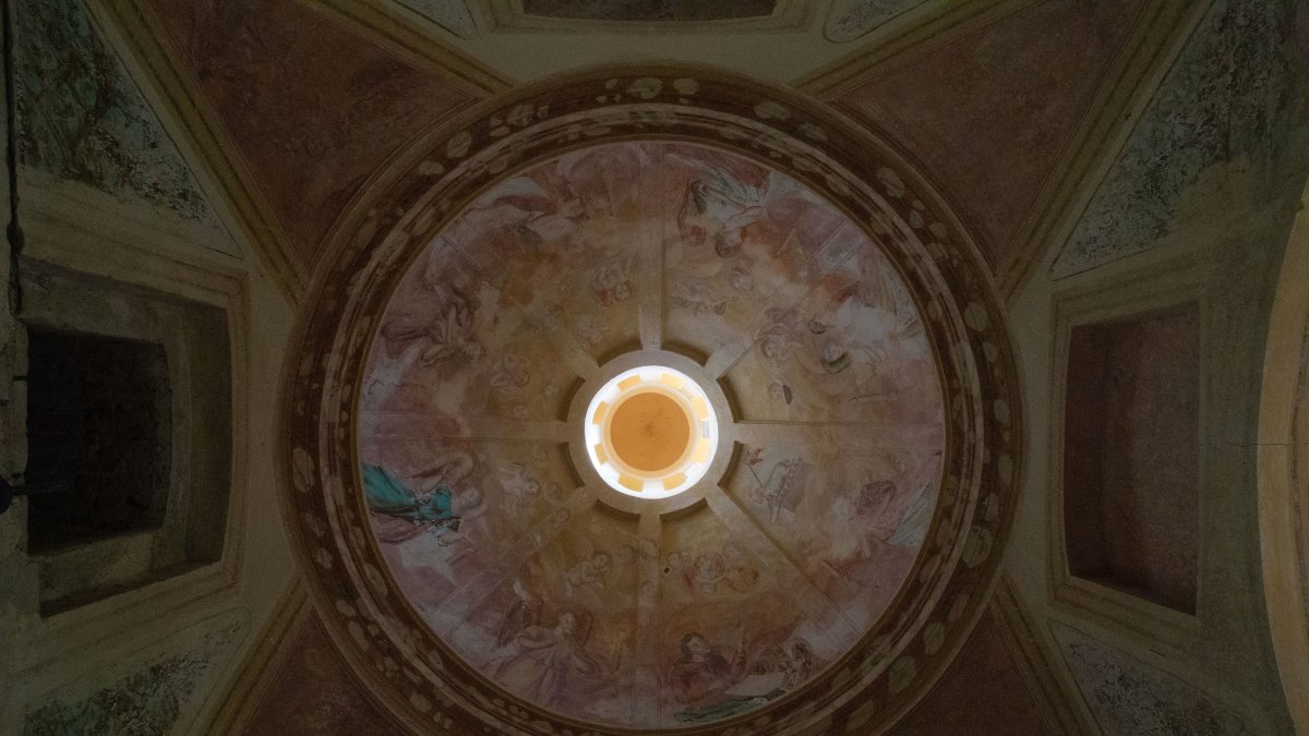
Professional help may be appropriate when the sanctuary includes historic decorative finishes, deteriorated plaster, tall or hard-to-access surfaces, or a color decision the committee cannot resolve on its own. Contractors experienced with historic church interiors may be better equipped to coordinate preservation-sensitive surface preparation, plaster repair, decorative finishes, and access requirements.
A professional color consultation can also provide committees with a documented, architecture-based rationale for the palette that can be shared with the congregation and preserved for future decision-makers.
Frequently Asked Questions
How often do historic church interiors need repainting?
Repainting intervals vary based on moisture conditions, plaster stability, candle or incense use, coating type, traffic, and surface preparation. Rather than relying on a fixed timeline, churches should monitor the interior for staining, peeling, chalking, fading, or plaster deterioration. These conditions may indicate an underlying moisture, substrate, or coating issue that should be addressed before repainting.
Can a church change its historic interior colors, or must the original scheme be restored?
Churches may be able to choose new colors when no local designation, applicable preservation requirement, or project-specific restriction governs the interior. Restoring an earlier documented scheme is one option, while another is selecting a compatible palette that respects the architecture without replicating every historic detail.
Should plaster repairs happen before or during a sanctuary painting project?
Plaster repairs should be completed before final painting begins. Paint applied over cracked, loose, or water-damaged plaster may fail prematurely. Coordinating the plaster repair and painting scopes can also help repaired areas blend more consistently with the finished walls.
How can churches keep services running during interior painting?
Many sanctuary painting projects can be phased by section, with scaffolding, dust protection, and low-odor coatings planned around the worship calendar. Clear scheduling between the contractor and church staff can help minimize disruptions to Sunday services, weddings, funerals, and other scheduled events.
Do dark paint colors ever work in historic sanctuaries?
Yes, in the right locations. Deep tones can add richness to chancel walls, ceiling panels, or accent details, particularly in Victorian-era interiors. Full rooms of dark color are riskier in Boston sanctuaries with limited natural light, so large-scale testing is essential first.
Ready to Plan Church Interior Painting for Your Boston Sanctuary?
Artech Church Interiors, Inc. is a fourth-generation church restoration and renovation company providing interior painting, plaster repair, and sanctuary renovation services for houses of worship.
Talk through your color questions before committing to a palette. Contact Artech Church Interiors to arrange a no-cost, no-obligation site appointment and discuss your sanctuary painting project.